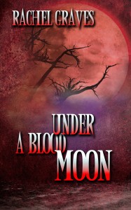
I’m delighted to reveal the cover art for Under a Blood Moon, coming soon from Wild Rose Press:
And there it is.
When I started writing, I had no idea cover art wasn’t designed by the author. I imagined myself meeting with an artist, making rough sketches on the back of a napkin, and then finally going to a studio with soaring ceilings and paint splotches everywhere. I’d stand before an easel and perfection! My book cover revealed.
Except that it turns out most covers don’t start as paintings. The artists work with digital editing software, not paint brushes. When my book was contracted for publication I was sent to an online form, not a meeting in a café. After dutifully filing in the blanks with a description of my heroine, hero, and the location, I had nothing to do but wait anxiously.
Why the anxiety? Authors don’t get approval rights over their covers. People judge books by their covers and most authors aren’t experts at marketing and selling books. Publishers are. It makes sense to let them make the decisions. If an author sees something they don’t like they can mention it, but the publisher isn’t obligated to act on it. It’s easy to daydream about perfect covers that exactly capture your book, but fears creep into your mind at the same time.
The internet is happy to share the details of covers gone wrong. There’s the painful, hilarious Kindle Cover Disasters blog and the more harrowing accounts of white washing and blond-ing of covers. The latter comes from the perception that sales are higher for blond heroes in romance and white girls in young adult. Covers reflect that to market the book, even when it’s not what’s inside. Authors post angry recriminations or apologetic notes, but that’s all they can do. The publisher gets final say.
I’m grateful my publisher doesn’t play those games. The design above is actually the third cover for Under a Blood Moon. My suggestions for the cover art were accepted and implemented quickly. One cover had a very marketable petite blond woman, but my brunette heroine wears a size large. The publisher was fine to remove the skinny blond, even though she might have generated more sales.
I’m happy with the spooky image we ended up with; it communicates the atmosphere of the book without putting ideas in the reader’s head about who does what inside the pages. Even better it reminds me of all those wonderful pulp horror novels I devoured as a teen. I’ll be making the cover art into a quilt later, and I can’t wait to see it in person.

June 1, 2015 @ 8:38 PM
Yay! How fun–and congratulations! 😀
I haven’t heard that about the blond-ing of heroes before. I thought the term was tall, DARK, and handsome. 😉 And I had a heck of a time finding a blond stock image for my short story because most of the stock images are for brunettes (for men). I could see the blond thing for heroines though. That’s definitely a societal “preference.” *sigh*
I was adamant that the cover of my second novel NOT be white-washed. The hero has dark skin and dreadlocks, and I searched for months to find an image true to that. I’m so glad your publisher respected your requirements and came up with a cover that works!
June 1, 2015 @ 8:53 PM
Thanks, Jami! Did you do a blog post on your cover art process? I’d love to hear about the hunt for a dreadlocked hunk.
June 1, 2015 @ 9:21 PM
I haven’t done that blog post yet, but I should! 😀
Yes, the vast majority of dark-skinned, dreadlocked hero images were somewhat racist (IMHO), as they portrayed slacker-and-drug-using types. And when I say “vast majority,” I mean 99% or so. *sigh*
The impression anyone would have from a search of images for dreadlocks was that those with dreadlocks couldn’t be clean, professional, attractive, intense (without looking like a convict), etc. I’ve heard similar stories about trying to find POC for heroines. A couple of months ago, I actually supported a Kickstarter for Mosaic Stock, as their goal is to provide diverse stock photos. I hope they succeed because, boy, does the industry need it!
I finally found a new cover model with a different set of images by changing my search terms (I thinks “dreds” instead of “dreadlocks”). Photo tags are SO important for being found, so I guess that’s a good lesson for the metadata of our books. LOL! That model had several poses to choose from, so I feel that we got lucky at the last minute. My cover artist just had to tweak his eye color (paranormal) and make his dreads longer. Yay!